Plein air painting, or painting outdoors, is a wonderful experience that many people are unfortunately too intimidated to try. Contrary to popular belief, you don't actually need much to get started, or any fancy supplies at all.
There are so many benefits to painting in nature that you just don't get inside a studio - and there are plenty of challenges to keep it exciting too!
In this post I'm going to go over some basic supplies you'll find useful, how to pack them, a few environmental and safety considerations, and a couple tips and techniques to help you get started.
Whether you're heading out to a local park, going on a day hike, a backpacking trip, or wanting to climb a mountain with watercolors in tow, these tips will serve you well.

This is a kit I always have at the ready to grab and stick in my purse or backpack. It doesn't take up much space and contains everything I need to spend some time painting on the go.
Basic Plein Air Painting Supplies
When assembling your plein air painting kit, there are essentials, items that are extremely useful, and then a few more things that are great but not necessary. I like to tailor my kit to the occasion based on organizing my supplies into these categories.
Essential Plein Air Painting Supplies
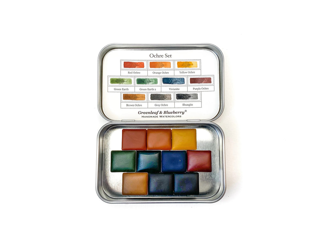
1. Color Palette - There aren't any magic colors for plein air painting - you can just use what you have. If you're excited to assemble an outdoor or landscape specific palette, I would recommend going heavy on the greens, have a few browns for convenience, and of course a handful of blues. Here is my favorite assortment of colors when packing light:
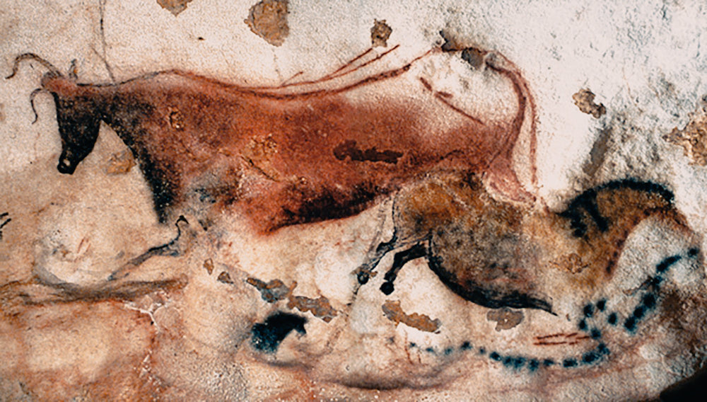
I prefer using natural pigments for landscapes, plants, and natural subjects - the colors just match more effortlessly. I also use these as a base if I need to mix a brighter color. I also carry the modern primaries so that I can punch up the volume on the natural pigments, or if I want to match a color I see more exactly. However, using a purposefully limited palette will give your paintings a wonderful effect. Remember: You do not need to match colors exactly, or even a little bit. The best colors to pack are ultimately the ones you have or are most excited to use.
2. Paper/Support - Choosing your support depends on the purpose of your painting. If you are creating a travel journal for yourself, just pack a sketchbook. If you are interested in creating a painting for sale or display, you'll want to pack some paper and a board. I recommend gator board, as it is lightweight, rigid, and water-resistant. However, it can be expensive. You can also use a piece of cardboard laminated with shipping tape.
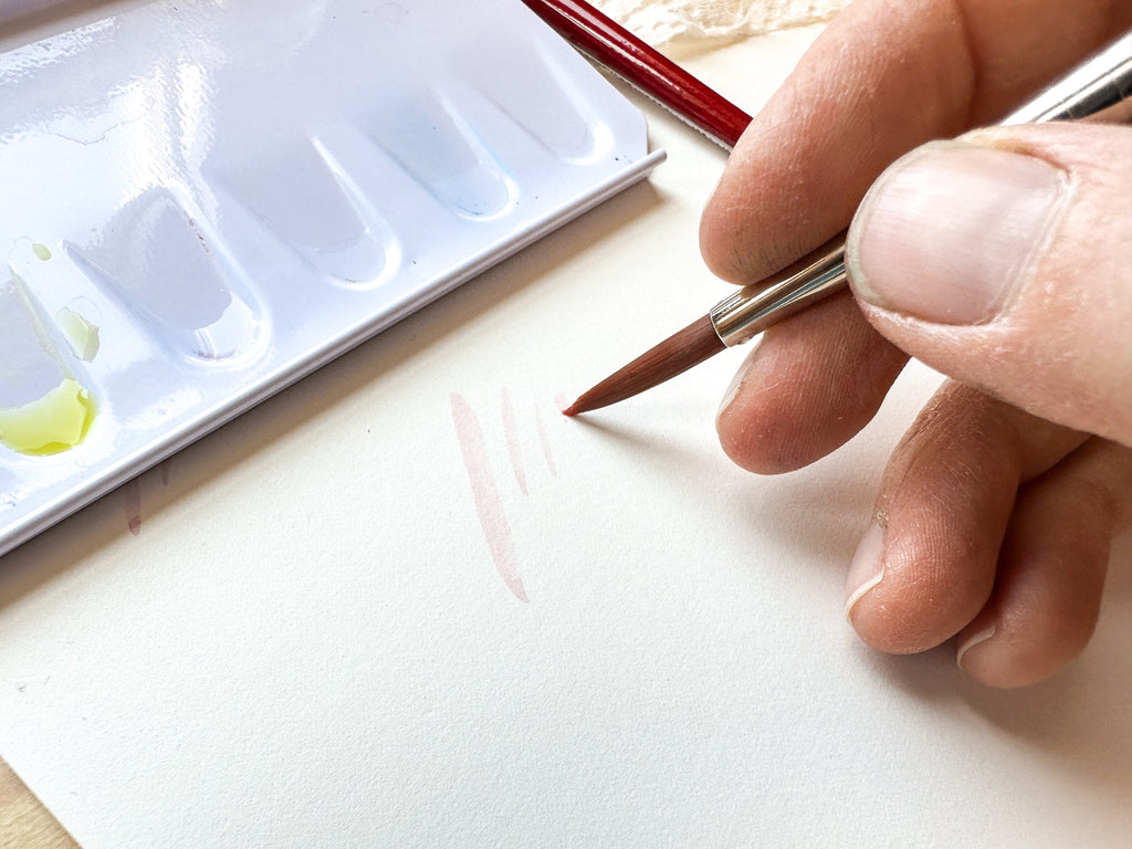
3. Brushes & Water - There are wonderful travel-specific brushes on the market (my favorites are made by Da Vinci), but any brush can be adapted for travel with al little forethought. The most important thing to remember when traveling with brushes is to mind the tips! Ensure that no harm will come to your brush tips when packing them, and the rest is just preferential details. Likewise, use whatever water cup you would like - just make sure it does not leak! I would generally recommend against glass as it is heavy and breakable. Choosing to pack waterbrushes will erase your need for a water cup, and they also very conveniently have caps! So, they can be treated quite casually. These are my favorites, and you can read more about waterbrushes here.

A selection of some of my favorite travel art supplies. It's not at all necessary to bring all of these. I will generally choose from this collection and tailor the selection to the kind of outing on which I'm going.
Useful Plein Air Painting Supplies
1. Carrying Case - Again, you don't need anything fancy! Just something that will contain all of your supplies, so they are bundled and at the ready. You can use an old fishing tackle box or tool bin, a purse, small backpack, or zippered bag of any kind. Search for these at thrift stores and you're sure to find something that will work.
2. Pencil Bag - I say bag here on purpose. I suggest a bag over a box or a tin, as they are easier to pack and actually better at protecting your pencils. Tins can leave pencils to rattle around as you move, which can crack their core. A soft bag cradles them better. You can purchase a pencil bag from all kinds of different vendors or shops. A cloth napkin wrapped in a rubber band will also do the trick! And, of course, they aren't just for pencils - I store all of my plein air drawing and writing tools in my pencil bag.
3. Pencils - Bring a medium-hard pencil for sketches that will stay light so that you can paint over them. Or, bring a light water soluble pencil so that your drawing will wash away as you begin to paint.
4. Viewfinder - These are wonderfully useful, and oft overlooked. This is my number one hack on how fight overwhelm when facing a vast landscape and wondering how on earth to fit that onto your sketchbook page. Pull out your viewfinder, start zooming in and out and moving it around until you spot the composition you want to focus on. Here is the thing: you don't have to buy one. You can use your fingers, or cut a rectangular hole (or whatever shape you prefer to work with) into a piece of cardboard.
5. Erasers - I like to carry a few: a kneaded eraser for lightening my basic sketch, a large white plastic eraser for erasing large areas without damaging paper, and a detail eraser for making tiny adjustments. However, the eraser on the end of your pencil is better than nothing!
6. Valuefinder - This may sound sophisticated, but once you understand what it is and how to use it, you'll see it's basic. You can of course buy one, but making one is really simple. Do you have an old pair of 3-D glasses laying around your house? Tear a pair in half and pack the red eye in your kit. All you need is a red transparency to peep through when you look at the view you want to paint. Why? The red tint allows you to concentrate on value as it blocks out most colors.
7. Binder Clips - These are useful for anything and everything. I carry a few different sizes. Use them to clip your palette to your sketchbook, clip your sketchbook pages in place, hold a reference picture in place, as a paintbrush holder, etc.
8. Rubber Bands - Like binder clips, these are useful for all sorts of things, but only if you remember to pack them!
9. Handkerchief - Paper towels work too. A handkerchief can be tied around your wrist, and of course washed and re-used. You can always tuck it into the back of your hat to block the sun from your neck, or wet it to keep yourself cool when painting in warm weather. It's wonderfully multi-functional.
10. Mister - Use a pocket mister to quickly spray down your color palette a few minutes before you start painting. It will give you colors a chance to soften up and be nice and juicy. This little trick can also save your brushes some miles. The friction and rubbing of your brush tips as you activate you colors can cause a lot of wear and tear over time. Pre-moistening your colors both saves you a little time and the point of your brush!
11. Tape - Weather you are taping sheets to a board or using it to frame out an area of a journal page, a small roll of tape is endlessly useful. Not only does it hold things in place, it can give your paintings a crisp border that adds an extra "finished" feel. You can also use tape to mask out areas of your painting to preserve some white or to control washes. There are lots of different types. It's best to find something archival and low-tack (so it won't tear your paper or leave a residue), and smaller rolls are of course more convenient for a travel kit.
Delightful Extras for Painting en Plein Air
1. Chair - The outdoor industry offers all sorts of foldable, collapsable, and packable lightweight chairs and stools. Often, it is easy enough to find a natural perch, like a stump or a rock, but if you're planning to paint for more than thirty minutes your bottom, back, and legs will be much happier parked on something specially designed for sitting, whether you work at an easel or in your lap. If you choose to pack one, just make sure it's lightweight and not to cumbersome - a large or heavy chair can make a long hike seem even longer!
2. Brush Holder - If you opt to pack traditional brushes instead of travel brushes, then this piece is essential. A brush holder should first and foremost protect the tips of your brushes. Secondly, it should allow some air circulation. If it doesn't allow air movement, just make sure to let your brushes dry later on.
Two of the biggest hazards to your supplies are caused by traveling with traditional brushes. They can be easily ruined if not stored properly, and if they aren't allowed to dry they can mold. A moldy brush can inoculate your paints with mold spores and cause them to mold. Moldy brushes and paints are easily remedied by some washing and rinsing, but best to just develop good practices and avoid the hassle.
3. Easel - This is truly a personal preference. Easels are a wonderful way to free you up so you feel less like a table when you paint. There are many options from the heavy, complicated, and costly to the homemade. You can assemble one pretty cheaply using an old camera tripod and a pice of gator board with a nut on the back. For watercolors, I suggest you find an easel that allows your painting to lay horizontally, unless you really love the drippy look. Plenty of plein air painters work out of a sketchbook and skip the easel entirely - still others attach a sketchbook to an easel.
4. Umbrella - As long as it's not too windy, an umbrella can be a handy way to keep harsh, direct sunlight off your painting. Really, it allows you to have a little more control on your lighting, as that is one of the most unpredictable aspects of plein air painting.

Pairing a tiny color palette and a single waterbrush with a small sketchbook makes an extremely lightweight kit, while also providing everything you really need!
Scaling Your Supplies To Match Your Degree Of Travel
Depending on the length and type of trip, I pack my plein air kit a little differently. A short hike up a trail to your painting destination is very different from a multi-night backpacking trip where you'll be stopping multiple times to both paint and camp.
Short Approach - Excursions specifically to paint outdoors that don't involve a long approach allow you the most latitude in terms of what you pack. You can even make several trips to your car for supplies, so you really don't have to concern yourself with the logistical limitations of schlepping supplies around, and can really focus on the painting and outdoor experience (and less on weight and transport).
Day Hike - Think about the distance you will be hiking and determine what weight you're comfortable carrying for that distance (and incline, if there is any). A day hike allows you more weight latitude than a backpacking trip, where you would be carrying things like a tent, sleeping bag, camp stove, and water filtration system. You still want to keep the weight manageable, but you can throw in a few more extras, and if you overpack your regret will only last for a day (or for as long as you have sore muscles).
Backpacking Trip - I'll pack only the essentials to minimize the weight I'm carrying on my back. You'll quickly find that every little bit matters as your pack weight ticks up, as each gram has a way of making a mile stretch a little longer. This is where you can get crafty to shave weight - pack only as much as you will use. I've even transferred tape to a smaller roll, cut ends off of my brushes, pulled Full Pan colors out of my palette, ditched my pocket mister entirely, and packed a plastic water container instead of my favorite glass one.
Car Travel - If you are on a multi-day trip by car, you can pretty much pack what you want. Road trips afford plein air painters a wonderful opportunity to experiment with lots of different supplies and concentrate more on the changing landscape.
Air Travel - If you are traveling by air and just carrying suitcases, you will of course want to be space and weight-conscious. You will also want to avoid packing anything that will be mysterious and suspicious to airport security - leave your nice scissors at home! Pro Tip: refer to your watercolors as just that: watercolors. Avoid calling them "paints". To non-artists, especially those working at the post office or the airport, "paint" is assumed to contain solvents, which can be flammable or explosive. Watercolor paints are not in that category of concern. I pack for air travel similarly to how I pack for a day hike.

Finishing a climb with Matt in Washington State. When you're carrying very little it's essential that you pack intentionally and carefully!
Environmental Considerations When Plein Air Painting
It is too easy to be cavalier about nature, especially for the inexperienced enthusiast. Whenever you venture outside, always try your best to be prepared. It is surprisingly easy to equip yourself to deal with situations that otherwise could become dangerous.
Before You Head Out
Notify someone of your whereabouts. If you become lost or something happens to prevent your planned return, this is your lifeline. Let someone know where you are going, when you are leaving, when you plan to return, and what exactly they should do/who they should call if you don't return or contact them at the appointed time. It is easy to shrug off this precaution for a short trip, but it is so easy.
Make a permanent packing list. It saves so much time if you're not always having to re-invent the wheel by thinking through what you need to pack every time you head out - and it ensures you won't forget anything important! It can also remove a key barrier that prevents people from even going. Type up or write out a packing list and post it or keep it somewhere handy. Take this a step further and keep your plein air gear together in one place and at the ready - that too will save the time it takes to round it all up each time.
While you are out, keep your wits about you and remain aware. Storms can roll in quickly, animals can approach, other people can surprise you, and sunburns can slowly sear you. It is wonderful fun to be engrossed in your painting, but try not to take your safety for granted. Keep an eye on the sky, your surroundings, and your watch, and you should be fine.
Respect nature. Not only for the sake of maintaining a pristine environment, but for your own safety and comfort. Stay on designated trails, don't underestimate the weather, and for the sake of all that is good, don't try to take a selfie with wild animals.
Leave No Trace
Whether we wish to acknowledge it or not, we have a reciprocal relationship with our environment. When you enjoy the outdoors, try to leave the space as you found it so that other visitors can enjoy it, its inhabitants can continue to thrive, and so that you can enjoy the space again another day. Avoid creating new trails, disturbing local flora and fauna, pack out your poop and trash. And if you are in a drier region, try to be aware of the deceptively delicate landscape - cryptobiotic soil can look just like dirt, but takes thousands of years to form and is a part of that fragile ecosystem.
Here are the 7 Principles of Leave No Trace:
1) Plan Ahead & Prepare
2) Travel & Camp On Durable Surfaces
3) Dispose of Waste Properly
4) Leave What You Find
5) Minimize Campfire Impacts
6) Respect Wildlife
7) Be Considerate of Other Visitors
The above is from the National Park Service. You can read in more detail about them here.

This photo was taken about 90 miles in on the Wonderland Trail around Mt. Rainier in Washington State. My pack averaged around 30 lbs. on that trip. While I didn't end up needing all of the 10+ Essentials, I had them all packed!
The 10 Essentials
The 10 Essentials are the backbone and foundation of outdoor travel. Even if you're not backpacking, it is good to be aware of them and carry these things with you. Do you have to carry all of these things every time you leave the house? No. But they are all generally small and lightweight, and are an excellent insurance policy to help you out if you end up in some unexpected trouble in the outdoors.
1. Navigation - Map, compass, GPS, smartphone (check ahead of time to ensure you'll have coverage in the area you'll be visiting).
2. Hydration - Bring enough water and some extra. You can also carry a water filter if you're concerned you will run out or if you don't want to carry the extra water weight. Packing electrolyte tablets to put in your water can really help on longer hikes and trips!
3. Nutrition - Make sure to pack snacks! Bring more food than you think you'll need. It's amazing how quickly your body burns through calories when you're moving around over terrain.
4. Insulation - Even if it's a hot day, pack a wind-breaking layer. Even on mild days, wind can really sap you of body heat. Also, while the weather might seem just lovely, when you're standing still painting or sitting on a rock, you body can really cool down when it's not moving. Layers can also block the sun and protect your skin on hot days, so insulation isn't juts for cold areas and seasons.
5. Illumination - You never plan to get stuck out overnight. Sometimes the sun can set while you're racing to finish a painting, and other times the return trip can just take longer than planned. Pack a headlamp or flashlight with fresh batteries (or charge).
6. Sun Protection - Hat, sunscreen, and/or light layers. I'll often wear thin wool layers in summer because it has a high UPF (the textile equivalent to SPF). Sun protection isn't just a vanity thing - too much exposure can dehydrate you, exhaust you, and even leave you with medically serious burns.
7. First-Aid - Just pack a kit of things you understand how to use. Bring any medications you need and supplies for treating minor scrapes and cuts. If you feel insecure about extended outdoor travel, sign up for a basic first aid class. It will build both skills and confidence, and you'll learn exactly what to do with a more extensive first aid kit. This knowledge and supplies can literally be a lifesaver. Here is a link to a relevant class finder through the Red Cross.
8. Fire - Matches, flint, a lighter. Outdoor stores carry very small, packable options. Consider this just for emergencies. If you plan to make a campfire, just check ahead of time to see if there are any burn bans in effect where you will be traveling.
9. Knife - Does not have to be fancy, but you'll want it to be safe to carry and sharp enough to use. Useful for all kinds of things.
10. Shelter - You don't need to pack a tent every time you go out. This is for emergencies. An emergency bivvy is more or less a lightweight sack, but one you'll be extremely grateful to have if you get stuck overnight. These can pack down to be as small as a reusable shopping bag.
Extras
There are a few extra items, in addition to the Ten Essentials, that I consider essential as well:
1. Bug Repellant - Or a bug net. If you end up out on a beautiful day, only to be harassed to the point of insanity by flies or mosquitos, you'll really wish you had these!
2. TP Etc. - Everybody poops. There is no shame in packing toilet paper and a blue bag (for poop). If anyone tries to give you grief about this, just act concerned and suggest they make an appointment with their doctor if they aren't pooping regularly. Ladies: If you don't already know, there are funnels on the market made just for us so that we can either pee more discreetly or use outhouses without sitting down. You can also wear a skirt to help you pop a more discreet squat.
3. Hand Sanitizer - You'll want some after using an outhouse.
4. Communication - Pack a phone or satellite communication. These days it's too easy to be in touch to not be. It's much easier to call for help if you need it, rather than wait for it.
Basic Plein Air Painting Tips & Techniques
Of course you can hike yourself out to an epic vista and choose to paint anything you want, but I'm just going to suppose we're out there to paint what we see. When painting outdoors, you are facing unique constraints and parameter: you've brought only what you can carry, you are subject to quick changes in light and weather, and will only have a limited time to take it all in before you pack up and head on your way again. There are certain tips and techniques that you can employ to make the most of your time outside painting.
1. How To Pick Your Subject - Just knowing where to start can be hard! Grand vistas can be very overwhelming. I suggest you carry a viewfinder (a small piece of paper with a rectangle in it). Peer through it like you're looking through the viewfinder of a camera and pan around the landscape. Move it closer and farther away from your eye to "zoom" in and out. Wait for a composition to come into frame that appeals to you. You can go big or focus on a detail. You can even choose to paint some of the local flora if the horizon line isn't calling your name. Just because you're outdoors don't mean you have to paint a sweeping landscape. Look for what interests YOU.
2. Quick Sketch - Once you've chosen your view, it's time to begin translating it to the two dimensional world of your paper. Use a pencil to lightly and quickly sketch in the main features. Try to work from the shoulder or elbow to keep your sketch light and gestural. Make sure you're looking at your subject just as much as your paper, if not more so. Now is not the time to get overwhelmed by the details. Try to focus on speed, observation, and the experience.
3. Block In Colors - Once you're ready to pull out your paints, use light washes to block out the main areas of color on your paper. This can really help give you the feeling of having dove in. Just make sure to keep the colors really light at this point - it will keep your painting flexible.
4. Work Light To Dark - In watercolors, it is much easier to build and intensity your colors as you grow your painting. Establish and work on the lightest areas first, then gradually intensify colors and depth.
5. Build Color & Detail - Rapidly! - Try to maintain some speed and keep your painting loose - remember, you are trying to capture something that is maybe quite fleeting. You can always develop a more finished painting later. If I helps take the pressure off, you can think of paintings done outdoors as note-taking, a chance to study the volume of landscape, the texture of clouds, sketch in shapes, and accurately match colors. Many artists will record lots of notes on work done in the field to help bring them accurately back to that place when they are no longer there.
6. Take A Picture - If you run out of time to complete your painting or you want to develop it more fully later, then snap a quick picture. I would urge to to take a quick peek and compare you picture to the landscape - photos can have a flattening effect and colors can look more faded. Also the light settings, especially on phone cameras can do funny things. If you can, quickly edit your photo to make sure it resembles what you see as much as possible.
7. Keep It Loose - If you're having trouble keeping your painting loose, try holding your brush farther back on the handle, and even extending your arm farther out in front of you. If it helps to keep you moving, try to work the whole painting at once - it will keep you from hyper-focusing on one area and ending up with a half-finished painting.
8. Lifting - Did your light areas somehow disappear in a wash or in you haste? No worries, just lift out the areas that you want to dial back. Wipe your brush off to remove as much water as you can and it will act as a sponge or a straw to pull paint off your paper. You'll need to wet the area for this to work. Play around with your brushes before you head out to get the feel of this technique if you are new to it.
9. Bring Vodka - Painting in freezing temperatures? It's frustrating when you watercolors and washes start to freeze up on you. If this is an issue for you, try painting with vodka instead of water. It has a much lower freezing temperature and is completely clear! This tip comes from Maria Coryell-Martin from her time painting in the Arctic on scientific expeditions.
Building A Habit of Plein Air Painting
Painting is as much a practice as it is about production. While it is extremely satisfying to create finished paintings that we find pleasing, focusing solely on that outcome can come to rob us of the joy of reaching it. By intentionally placing our focus on the process then we win whether we are satisfied with the final painting or not. This is also the key to making your painting practice into a habit. Plein air painting is a wonderful dimension to add to that practice.
Below, I have just a few final tips and ideas to help you form that plein air habit:
Storing Your Supplies - Keep a painting kit at the ready at all times. This is separate from your at-home or studio supplies. This eliminates a whole host of items that you'll have to run down otherwise. By having the option to grab-and-go, you'll really increase the ease and convenience of bringing along your supplies when you leave the house. After all, you can't paint if you don't bring them!
Just Paint - You do not have to go anywhere "special" to paint en plein air. You can build skills in your yard, in a park, on the sidewalk, next to the side of the road, in a pasture. It's up to you and your eye to make what you see special. That is the essence of the role of the artist. Try to avoid only painting when you are inspired, and instead to think of your painting practice as just that - practice. Practice involves simply logging hours. Just like with running or playing an instrument, both your skills and your enjoyment will increase as you practice.
Benefits of Plein Air Painting - There are particular benefits to the practice of plein air painting. There are scientific studies that show spending time in nature is good for your brain. It has a way of refreshing our soul. The act of observation can be a kind of meditation. But transferring what you see onto paper leads you to observe in a particular and more minute way. You first trace every line of the landscape with your eye before you transmit it to your hand, then your hand transmits that to the paper. That right there is the magic. And that act right there is your purpose for being there in nature observing. It's a very alchemical type of relationship between landscape, artist, and tools. The painting is your reason and the practice is your medicine.
Make The Experience Yours - It's easy to get caught up in what other people do or the way you think you should be doing something when you begin a new pursuit. Try to avoid that. If you're outdoors holding a paintbrush you're doing just fine. Don't feel pressure to paint in a certain style, a particular subject, or with certain tools. Do keep mental notes of what you are drawn to and what excites you and move toward that. For example: You don't need a fancy, expensive portable easel to be a plein air painter. However, if you think having an easel like that is just the neatest thing since sliced bread, then get one and start going on adventures with it! Similarly, don't feel the need to paint grand, sweeping landscapes if it seems like a giant snooze-fest to you - if you'd rather paint rocks or do cloud studies or even something abstract, then do that. One other point: don't be afraid to set goals. If you want to paint sweeping landscapes, but feel that you lack the skills, then that is something you can work towards. Just try to be very self-aware about what you are drawn to and what you are not. Ultimately, the practice and the experience are yours. You'll find your joy in it by doing you.
This post is a long one, but it contains so many of the things I wish I would have learned at the beginning of my watercolor journey. I've accumulated all of this from my time in the mountains and on trails, and from my years with a brush. I hope you've found it useful, and that it can bring you some joy.
As always, thank you for being here and wishing you happy painting!
]]>
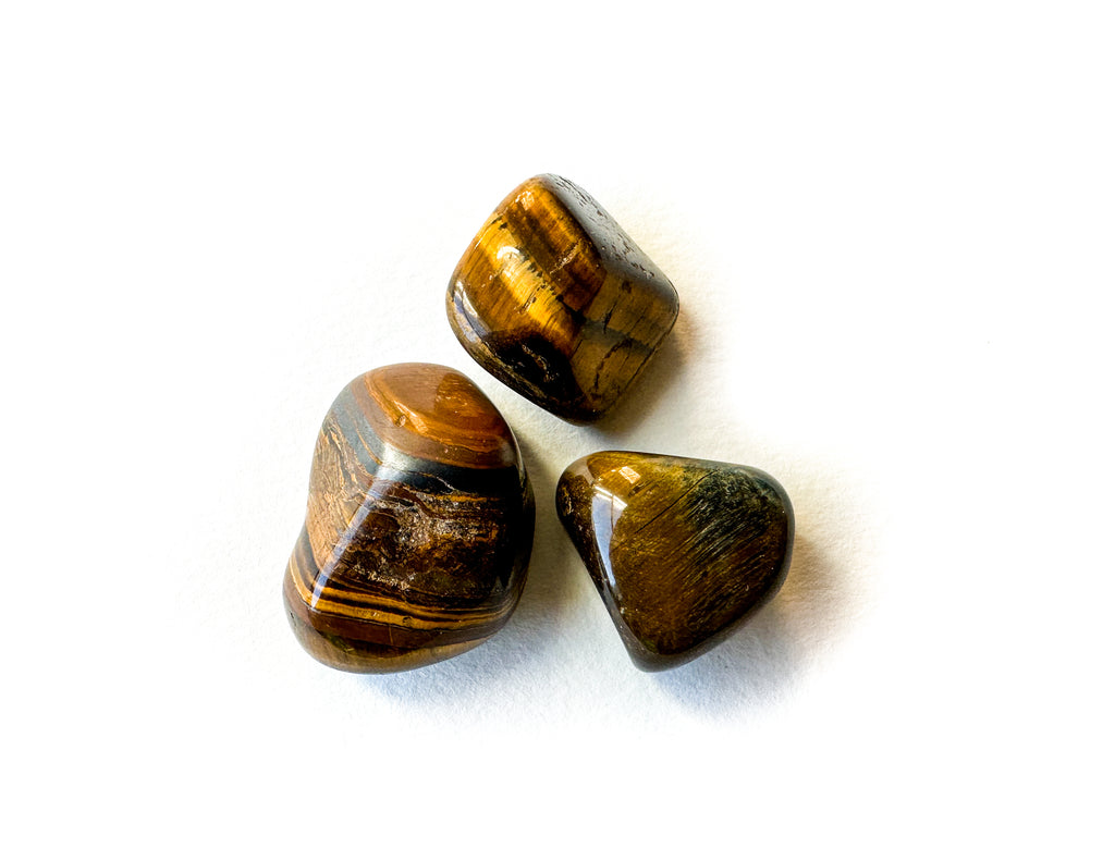 This is polished amber Tiger's Eye with visible bands of varying width.
 This is an unpolished Tiger's Eye stone. Note the parallel striations. This is what causes the light to dance when polished.
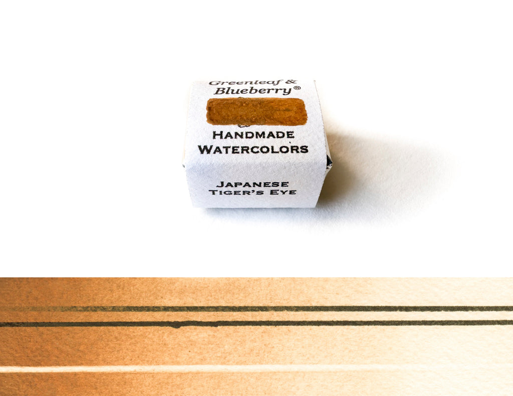


 Dry Smalt pigment on the slab at G&B studios.

 Dry Smalt pigment.


 Our Peackock Set, a collection of both modern and historical blues. from left to right, top to bottom: Australian Vivianite, Afghani Lapis Lazuli, Chilean Lapis Lazuli, Ultramarine Blue, Kazakh Azurite, Verditer, Yucatán Mayan Blue, Smalt, Phthalocyanine Cyan, Indanthrone Blue, YInMn Blue. (As of yet we do not offer a Prussian Blue because it is low in chroma, easily mixable, and psychotically messy.)


 Look first at the picture on the left and try to notice the lights and dark areas. Especially concentrate on the sky (they can be deceiving). Now look at the same picture through a red transparency. Notice how the distraction of color has been largely eliminated so that you can concentrate on just your values.
 These are the two tools I have used for years when I am trying to lay in accurate values. I use them to look at both the subject and my painting. I enjoy this style of small lens glasses because I can easily peer over the top of them or look through them when needed. Style must sometimes be sacrificed when there is painting to do!
 You can easily make your own value finders using the free downloadable templates provided with this post. You can make either a large finder, a small one, or both! Red transparency sheets can be purchased
 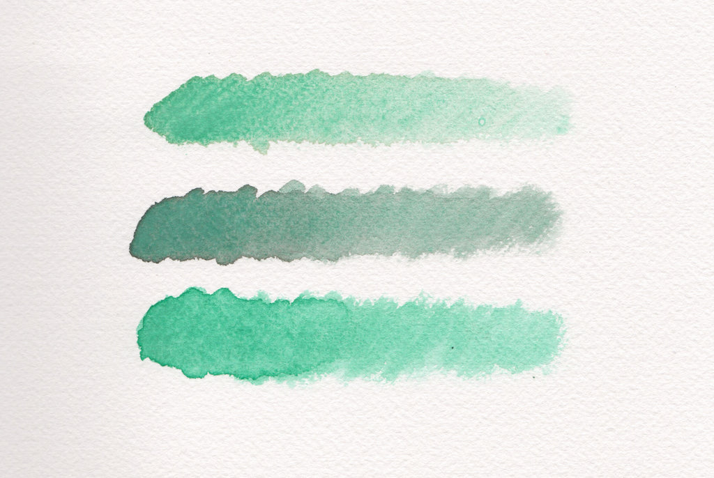 These quickly mixed swatches show Malachite at top, Malachite mixed with Lamp Black at middle, and Malachite mixed with Phthalocyanine Green at bottom. There is a bit of an issue with semantics afoot: when many people say they want to mix a "darker" color, they in fact mean more intense, brighter, higher chroma, etc. Black is dark, but a lighter shade of black is grey. Mixing in black to darken a color will make it more grey. If your object is to tint your color or knock down the chroma, then black is a perfect choice. However, if you wish to maintain chroma while darkening a color, choose a pigment with a similar hue but a wide value range to do the trick!
 This is Saint John the Baptist (John in the Wilderness) by Caravaggio, painted in 1604. The red cloak appear rich and vibrant, and the whiteness of his skin makes him appear monolithic. If the nearly-black background was lighter, this painting would have a very different impact, and the red would appear noticeably less vibrant. Caravaggio likely used Cinnabar or Vermillion as his red, which is a very beautiful red, but would appear rather subdued compared to modern pigments such as Cadmium Red or Pyrrole Red. Through the use of value, he was able to make his reds arresting.


 Looking over a palette of single-pigment paints can feel a bit like getting together with friends. Characteristics vary greatly from pigment to pigment, and even from pigments that are "the same" but from different regions. This is why we include country of origin in the names of our natural pigment paints. All of this helps to create a connection to your colors.
 This is a monochrome (single color painting) painted with our limited release German Pyrite (a single-pigment paint, as are all of our colors). Pyrite has highly unique handling characteristics, most notably a pronounced granulation and variegation. By understanding Pyrite's personality and traits (or unique set of characteristics), I was able to use it creatively for this monochrome.
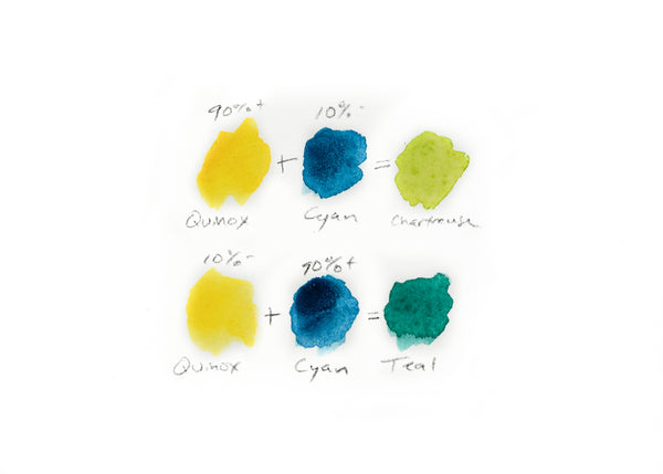
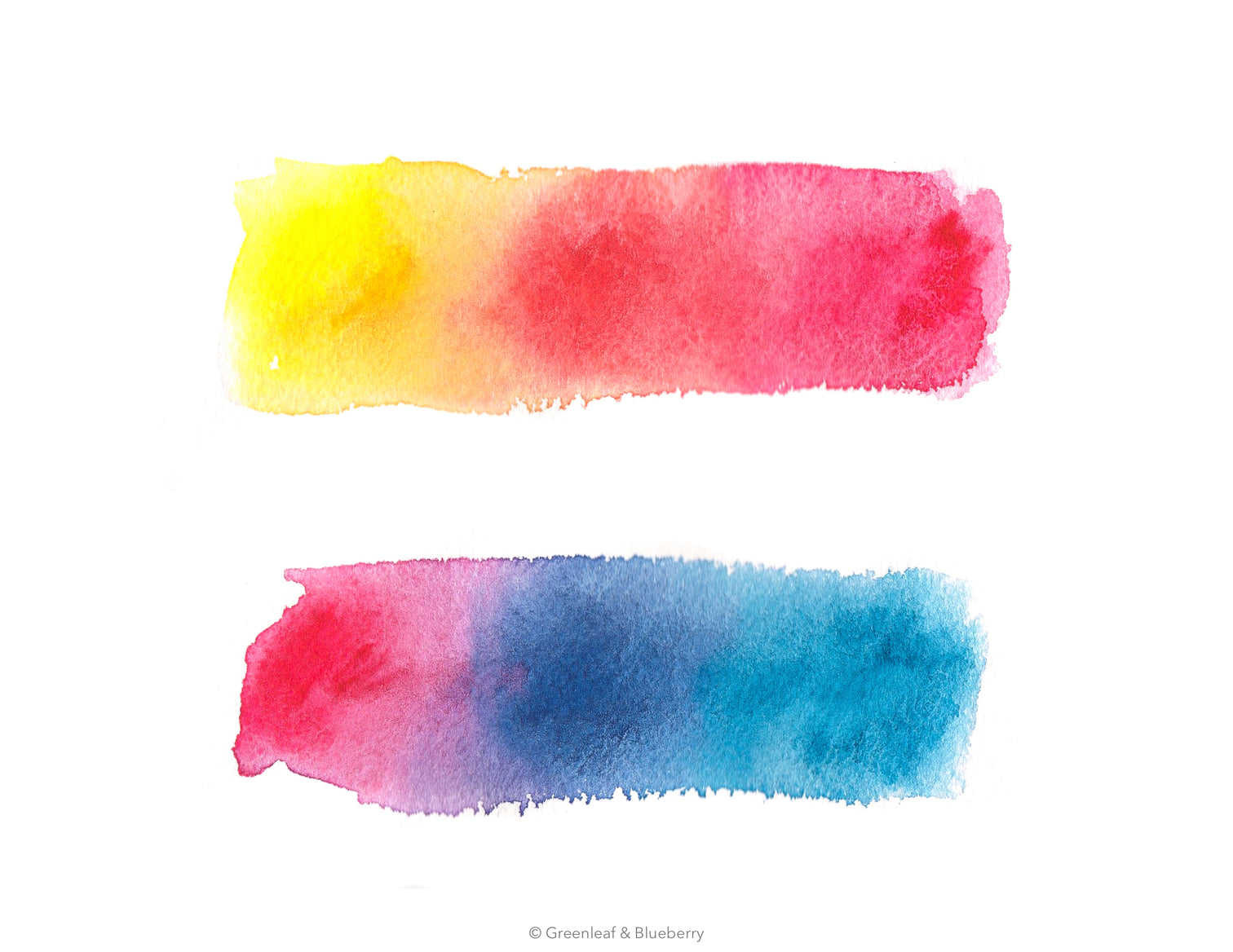 Top: Quinoxalinedione Yellow is mixed with Quinacridone Magenta, Bottom: Quinacridone Magenta is mixed with Phthalocyanine Cyan. All colors sold as a mini-palette
  Notice the split pea soup tones in this swatch. It is warm, but a bit dull. This swatch has three pigments in play.
 Notice the vibrancy of this swatch compared to the one above. It is higher chroma which gives it a kind of electricity. This swatch has two pigments in play.
 This Sap Green is another blend from a top mass-manufacturer that includes these pigments: PO48 (Quinacridone Burnt Orange), PY150 (Nickel Azo Yellow), PG7 (Phthalocyanine Green). The swatches are painted from most concentrated at left to least concentrated at right.
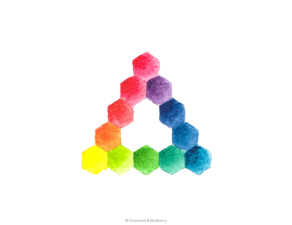
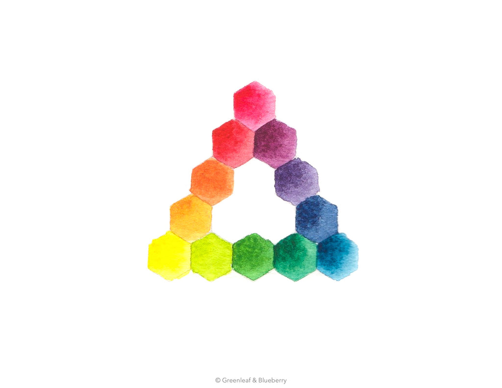
 These are the same pigments used in the Sap Green swatches above, but each single-pigment paint is mixed together in a variety of different ratios. Which hexagon looks most like the Sap Green swatches above?
 Only one pigment is listed. This is a single-pigment paint.
 Notice there is more than one pigment code listed.


 From left to right: A new waterbrush, my waterbrush (notice the deteriorated point), my young daughter's waterbrush (this could be cleaned up with some
  This piece functions both as a plug and part of the water flow control. It only allows water to move through a very small hole. Keep this piece in mind when you squeeze the reservoir for more water - the water is on its way, but moving through a very tiny opening!
 It is easy to get a little carried away squeezing your waterbrush and letting water dribble out the end. The picture above shows a water-laden brush head. This is just dandy if you are wanting to dilute a color in your mixing palette or work a wash. However, having too much water on the head of your brush can be very frustrating for more detailed painting.

 In watercolor, drybrush relies on a damp, not dry, brush.
 Testing a loaded brush on scrap watercolor paper is very useful. You will immediately notice if your color is diluted enough or if it is too strong. Also you can watch to see if there are color pools at the beginning or end of your strokes (indicating you have too much water).
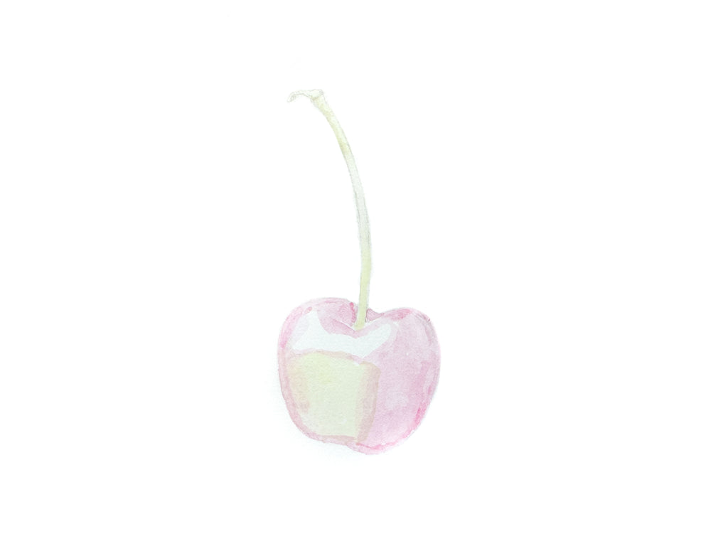
 A photograph I snapped of a Ranier cherry. You can use this as a reference to paint.
 The supplies I used for this mini project, each listed below.
 Pools of pure color in
  Graphite outline of the cherry, done using
 Underpainting that lightly blocks color areas and reserves white areas.
 First layer of color in place. It is easy to get frustrated at this stage - keep going!
 Second layer!
 Third layer!
 Fourth layer...
 Sixth layer
 Finished painting! Remember, the point of this tutorial is to demonstrate how the drybrush technique works to build up color in a controlled way. The object in doing this exercise is to practice drybrush - try to focus on the process more than the outcome!


 I like to mark my supplies and art gear with a certain pattern of washi tape, though I have also used green nail polish, as well as a variety of other methods. Notice how it is much easier to pick out the supplies above with matching washi tape markings?


 A color palette is not unlike a group of people, each with a unique set of quirks, behaviors, and traits that make up their personality.
 Hue Category: Red, Specifically Described: Magenta
 Hue Category: Yellow, Specifically Described: Cool Yellow or Lemon Yellow
 Hue Category: Green, Specifically Described: Cool Green or Mint
 Hue Category: Blue, Specifically Described: Ultramarine
 High Chroma
 Low Chroma

 Very Transparent
 Semi-Transparent
 Moderately Transparent
 Narrow Value Range
 Moderate Value Range
 Wide Value Range
 Low Tinting Strength
 Moderate Tinting Strength
 Staining
 Semi Staining
 Non-Staining


 Wide Range: Small Particles


 Indanthrone Blue Concentration Gradation Wash
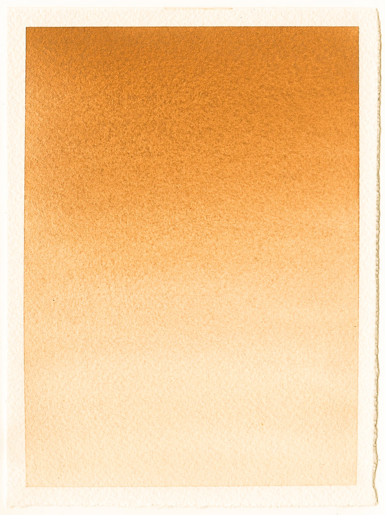
 French Orange Ochre Concentration Gradation Swatch: Low Chroma
 Indanthrone Blue Lifting Line Swatch
 Potter's Pink Lifting Line Swatch: Low Staining
 Value Scale Swatch
 Phthalocyanine Green Value Scale Swatch: Wide Value Range
 Indanthrone Blue Gravity Wash Swatch
 Phthalocyanine Cyan Gravity Wash Swatch: Flocculating
 YInMn Blue Gravity Wash Swatch: Dispersing
 Indanthrone Blue Graded Flat Wash Swatch
 Ultramarine Purple Graded Flat Wash Swatch: Moderate Granulation, Low Tinting Strength
 Dioxazine Violet Graded Flat Wash Swatch: Low Granulation, High Tinting Strength


 Greenleaf & Blueberry Indanthrone Blue Listing Picture


 Of course, there are noticeable differences between the printed scan, the painted pigments, and the hues mixed with CMYK colors. Primary colors are tools of approximation. But to have a leap in accuracy and ease is something to take note of and celebrate!
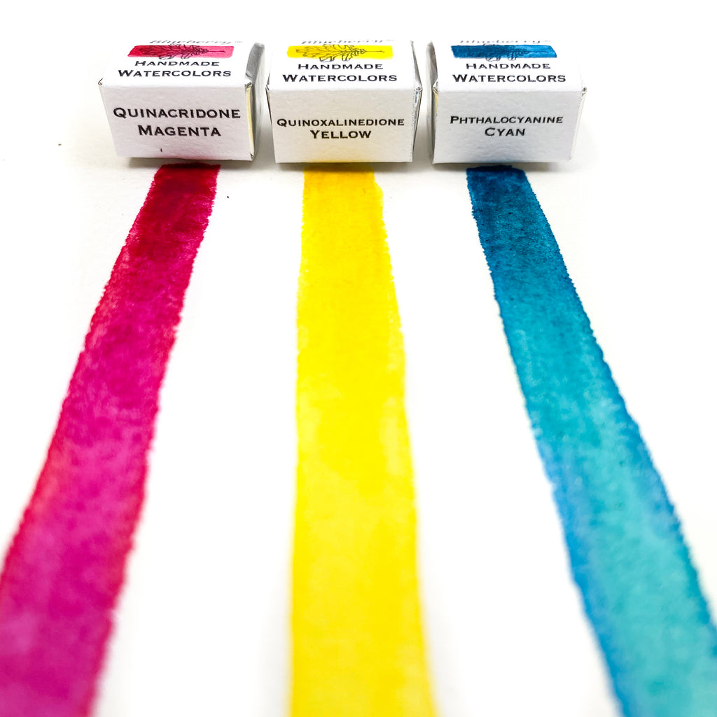
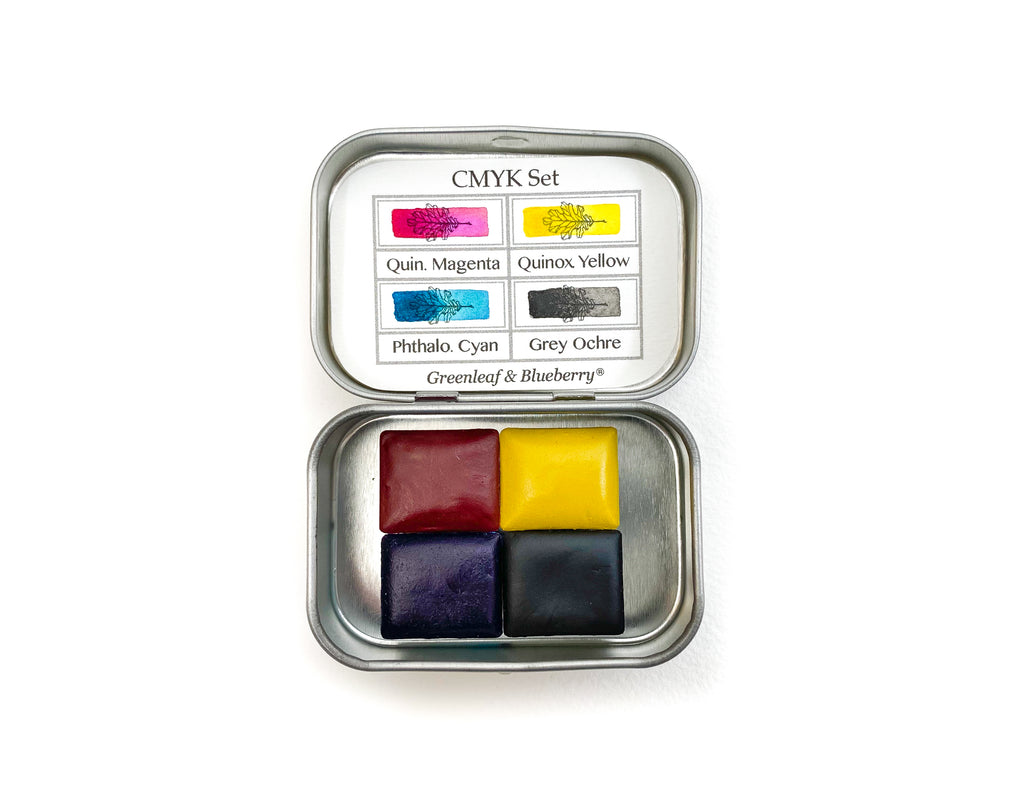
 In addition to Quin. Magenta, Quinox. Yellow, and Phthalo. Cyan, I have Ochre colors, Minerals, some Historical colors such as Potter's Pink, and even Faux Gold. Colors with a more intense tinting strength are in little Shells, while colors with a weak tinting strength or that I use a lot of are in Full Pans. I enjoy using my Modern Primary colors more to adjust and tint hues when mixing, and use other colors, such as Ochres as the mixing base. For more on how to build a palette from scratch, click