


Understanding Value Range For Watercolors (Free Download)
Value Range is absolutely one of the most important characteristics in watercolor paints. Understanding this concept will unlock untapped potential in each and every single one of your colors.
Value Defined
Value - Refers to the lightness or darkness of a hue.
Value Range - Refers to the range of lights and darks a color is capable of producing. The full range of dark and light increments is called a greyscale and runs from black at the darkest end of the range to white at the lightest end, with incremental shades of grey in between.

This is a classic greyscale painted using Lamp Black, a neutral black with high tinting strength and complete value range. It shows this color from most concentrated at left to least concentrated at right, with incremental steps in between.
Value In Watercolor
Each pigment has an inherent value range, which varies greatly from pigment to pigment. The darkest value possible for any given pigment will be the value it produces at highest concentration. All watercolors are capable of reaching the lightest value because they are diluted with water (which is clear) and painted (usually) onto white paper.
 Potter's Green has a notoriously narrow value range. Notice that even at its most concentrated, the hue is nothing close to black.
So, while all watercolors are capable of reaching white (the lightest value), not all watercolors are capable of reaching black.

Notice that Dioxazine Violet is nearly black at highest concentration. This means it has a range from almost white to almost black, giving it a very wide value range.
At their most concentrated some watercolors will appear black or nearly so, and these are termed as having a wide value range. Other colors will never appear very dark, no matter how concentrated they are (think yellows here), and these are termed as having a narrow value range. The colors that fall in between can be described as having a moderate value range.

Moroccan Red Ochre has a moderate value range. At most concentrated, it certainly doesn't reach black, but neither is it a very light hue.
If you are trying to make a determination of which watercolor to get between similar hues, it helps to assess them for the characteristics that matter most to you. If you prize granulation, then select the most granulating color. If you prefer colors with a wider value range, select the version with the wides range. For an example, click here to view our Value Scale Chart, then scroll to compare our Red Ochres. Notice which one has the widest value range (squint if you need to), which granulates the most, and which is the highest chroma (appears the most red).
Understanding Value Range Of Your Colors
The fastest and easiest way to figure out the basic value range of your colors is to take a look at your palette. Colors in the pan are at highest concentration. Those that appear as black or almost black in the pan have a wide value range. Colors that are lighter or that don't appear dark or black will have a more limited value range.

Take a look at these colors. Identify which ones appear black (or very nearly so) - these will have the widest value range. Next identify the very lightest colors - these will have the narrowest value range (whites have no value range). The colors that are left will have varying degrees of moderate value ranges. Eyeballing your colors this way gives you quick information about them. To get a detailed look, you'll have to swatch them out (see below).
There is no correlation between value range and quality. Each pigment's characteristics (just one of which is value range) is determined by their chemistry and the physical shape, size, and nature of their individual particles.
The best way to explore the value ranges of your colors in detail is to swatch them out from most concentrated to least. You can also play with your pigment to water ratios as you paint and note the results. You will quickly learn which colors have a wide range and which are more limited.
Being able to recognize and use the correct vocabulary to define how the value range characteristic expresses itself in different pigments will allow you to make more precise choices with how you paint with them (which gives you more control).
Painting Value Range Swatches
There is no wrong way to explore value range. However, having a standardized approach will allow you to compare your colors with greater accuracy, which will be more meaningful to you longterm.
Click here to see value range swatches for all of our colors organized into a chart. As you scroll up and down, notice how quickly your eyes can pick out the different value ranges on these swatches.
Creating a set of swatches not only allows you to explore a specific aspect of your colors, but it also allows you to compare pigments as you go, AND it also leaves you with a very useful reference tool in the form of a swatch library or set of "flashcards".
Please feel free to use our free downloadable templates to create your own value range swatches (like the ones in the lead picture above and on our Value Scale Chart). Download includes basic Instructions, templates designed to be printed onto 90lb. watercolor paper, and value finder templates (more information on those below.)
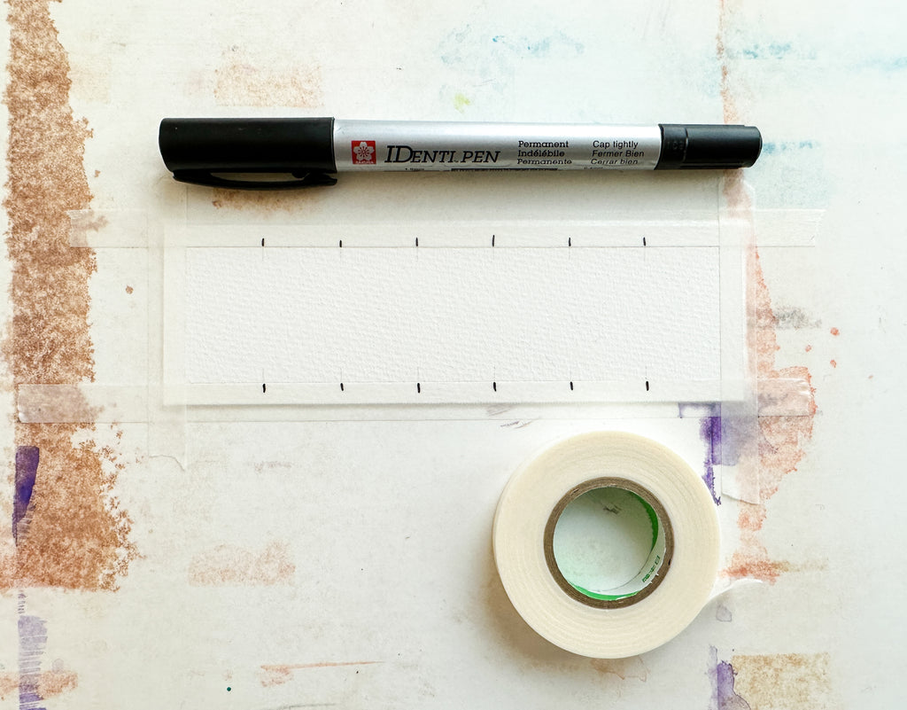
In addition to printed and cut-out swatches, your watercolor palette, and a paintbrush, we recommend tape for taping down each swatch while you work, and a waterproof fine tip marker to extend swatch marks onto your tape, so that you can still see them after you have added a few layers.
Seeing Value
Most people have no trouble understanding value when looking at a greyscale: black = darkest, white = lightest, grey in between, got it. However, many people can struggle to see value in color. Luckily, there are some convenient tricks to teach your eyes to see value beyond black and white:
1. Squint Your Eyes
This is pretty simple. By limiting the amount of light that reaches your eye, lights and darks will pop out in greater contrast, allowing you to focus less on color. While this works, it can be a strain on the eyes if you do it a lot.
2. Buy Or Make A Value Finder
There are two main types of value finders: one is more or less a greyscale with peep holes, and the other one is a rose-colored monocle, again, more or less.
- Type 1: Value Matcher
You can purchase these, but they are such simple tools that you will be better off making your own. Simply create one of the value range swatches detailed above using a true black, then use a hole punch to punch holes in each value increment. You can also create one that has more than five increments if you wish (the free template includes both increments of five and seven).

This is a commonly available Value Finer (or matcher). You simply hold it up to the area of your subject your are working on, decide which shade is the best match, then hold the finder up to your paper and palette and use it to help you mix/select your color.
To use this, simply hold it up to your subject to the area you are trying to paint or color match, and by looking through the holes, determine which increment is the closest match. This will help guide your color mixing and help you get an accurate gauge on what kinds of values your are playing with.
You can also make Value Matchers with any watercolor - not just black. You could even make one for every color in your palette to carry as a small deck in your travel kit.
-Type 2 : Value Finder
This is also a tool you can purchase, but they can be a bit harder to find, and they are also very easy to make or cobble together.
This value tool is just a red transparency. You look through it, and your subject is tinted red. As a result, colors are blocked and you are enabled to just focus on the lights and darks.
 Look first at the picture on the left and try to notice the lights and dark areas. Especially concentrate on the sky (they can be deceiving). Now look at the same picture through a red transparency. Notice how the distraction of color has been largely eliminated so that you can concentrate on just your values.
To make or find one, you'll need a piece of red transparency, which you can find at your local art supply store or a theater supply store. Just cut a small square and mount it into a small paper frame. John Muir Laws uses vintage slides: he swaps out the slide for the red transparency in the small frame. This tiny version is great for travel kits. You can also use red glasses, such as you might find at a Halloween store. A simple google search for "red tinted glasses" will yield many results. My pair are no longer in production, so I will recommend a specific brand when I have found a new one. If you have any old 3-D glasses laying around, you can commandeer the red eye piece!
I keep my red glasses for indoor studio work, and I carry a slide in my travel kit.
 These are the two tools I have used for years when I am trying to lay in accurate values. I use them to look at both the subject and my painting. I enjoy this style of small lens glasses because I can easily peer over the top of them or look through them when needed. Style must sometimes be sacrificed when there is painting to do!
Also included in the free download is a template for making a simple value finder with composition slider - two size options! You can purchase red film here, or request the large or small size of transparency in your order notes - we will include them for free this weekend while supplies last!
 You can easily make your own value finders using the free downloadable templates provided with this post. You can make either a large finder, a small one, or both! Red transparency sheets can be purchased here.
Using Value In Color Mixing
When lightening or darkening colors, the tendency can be to reach for white or black. However, it is important to remember that they are both technically shades of grey, and will therefore grey your color mixture (lower the chroma). This can give your mixed colors a dull or dead-looking appearance.
An alternative is to use colors with wide value range, which can preserve chroma and generally results in more dynamic colors.
For example, if you wanted to darken Malachite, you could use Phthalocyanine Green, which has a very wide value range. Using black for the purpose would indeed darken your color, but it would also make the green very dull. If the Phthalocyanine Green punches up the chroma more than you want you can tone things down with a touch of black or brown or red.
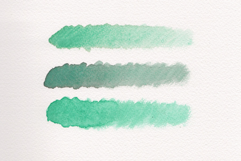 These quickly mixed swatches show Malachite at top, Malachite mixed with Lamp Black at middle, and Malachite mixed with Phthalocyanine Green at bottom. There is a bit of an issue with semantics afoot: when many people say they want to mix a "darker" color, they in fact mean more intense, brighter, higher chroma, etc. Black is dark, but a lighter shade of black is grey. Mixing in black to darken a color will make it more grey. If your object is to tint your color or knock down the chroma, then black is a perfect choice. However, if you wish to maintain chroma while darkening a color, choose a pigment with a similar hue but a wide value range to do the trick!
Using Value In Composition
A composition that contains only one value will look very flat. Varying your values creates contrast, which can accentuate your focal point and otherwise help direct the viewers eyes around the painting. Use your value finder to look at your subject and painting, and notice where the darkest and lightest parts are. Reserve the lightest parts of your painting and then build up layers so that the darkest areas have the depth you see in your subject.
Using Value With the Principles of Color Theory
By increasing the depth of your darker values (using colors with a wider value range), you can thereby shift the value scale of your painting. This makes whites look whiter and brights look brighter.
In this way, lower chroma colors appear to be higher chroma than they are. This is exactly how the Great Masters were able to paint such vibrant paintings using such limited palettes of colors (remember they didn't have access to colors like Pyrrole Red or the Quinacridones!).
 This is Saint John the Baptist (John in the Wilderness) by Caravaggio, painted in 1604. The red cloak appear rich and vibrant, and the whiteness of his skin makes him appear monolithic. If the nearly-black background was lighter, this painting would have a very different impact, and the red would appear noticeably less vibrant. Caravaggio likely used Cinnabar or Vermillion as his red, which is a very beautiful red, but would appear rather subdued compared to modern pigments such as Cadmium Red or Pyrrole Red. Through the use of value, he was able to make his reds arresting.
Using Value To Create Distance
Value can also be used specifically to create distance. Landscapes especially can appear very flat without a good contrast in values. Value can suggest light and shadow, but it can also create atmospheric distance. Think about looking out over a mountain range at the horizon line: the farther mountains will appear fainter, and each jagged layer will increase in darkness the nearer it is to you. Ensuring you replicate this effect using value will make your painting appear both accurate and alive.

Notice in this photo how the values change as the distance increases: the closes mountains are very dark, but as the layers recede into the distance they grow lighter. The colors also change, but it is specifically the value changes that make the distance palpable.
I hope this information is useful to you! Please drop any lingering questions in the comments below.
As always, thank you for being here and wishing you happy painting!
