


Anthraquinoid Red Watercolor Paint,Full Pan
Greenleaf & Blueberry Professional Handmade Watercolors
Color Overview
| Color Name | Anthraquinoid Red |
| Pigment |
Anthraquinoid Red |
| Pigment Index No. | PR177 |
| Chemical Formula |
C28H16N2O4 |
| Series No. | Series 3 |
| Lightfastness Rating | 5/5 Very Lightfast |
| Toxicity | 1/5 No Known Toxicity |
| Hue | Red Category |
| Chroma | 4/5 Moderate Chroma |
| Transparency | 5/5 Very Transparent |
| Pigment Type | Synthetic Organic |
| Granulation | Some |
| Value Range | 4/5 Wide Range |
| Tinting Strength | 4/5 Moderate-High Strength |
| Staining | Some Staining |
| Flocculation | 2/5 Dispersing |
| Variegation | Some |
Swatches
Color behavior assessments and descriptions are of course somewhat subjective, your perception being determined by your watercoloring experience. We offer this information with the intent of giving you an accurate idea of how a color will look and handle so that you can determine if it is a good fit for your palette and painting practice.
SCROLL DOWN FOR INFORMATION ABOUT HOW TO REACH EACH TYPE OF SWATCH
| Combination Swatch |
 |
| Gravity Wash Swatch |
 |
| Value Scale Swatch |
 |
Color Description
Our Anthraquinoid Red (PR177) is an intense, dimensional cool red with a hue between Quinacridone Magenta and Alizarin Crimson. It is completely transparent and has a very wide value range. Additionally, it has a fine granulation and subtle variegation to it, making it an interesting modern synthetic.
While often used as a more stable alternative to Alizarine Crimson, it is decidedly more blue (cooler). It is also not quite as high chroma as Quinacridone Magenta and Pyrrole Scarlet. However, it holds a unique position on the color wheel and is a pigment specifically useful for botanical subjects.
This color can be used as a primary red for more stylized secondary mixtures, for making subtle adjustments in the Red and Purple ranges, and it also functions beautifully straight from the pan because of its beautiful hue and intriguing characteristics.
Each of the above swatches have been painted onto Arches Cold Pressed 140 lb. watercolor paper.
Color Story
Anthraquinone pigments have been in use for hundreds of years, and are likely already familiar to you, such as the prized red bug cochineal, madder, and Alizarin. Anthraquinone is a term that refers to the identifying molecular group of natural and synthetics colorants. Anthraquinoid Red PR177 is a synthetic organic pigment derived from the discovery of Alizarin which was first synthesized in the 1860's by the German chemists Carl Graebe and Carl Liebermann. Anthraquinone pigments were first seen in artists colors in the early twentieth century. Most often associated with the dye industries, colorants for plastics, and automotive pigments, PR177 has a prized place on the artist's palette, however, it still remains an underutilized and underrepresented pigment, despite how long it has been available.
Additionally, Anthraquinone Red is manufactured by several different companies, and has a reputation for different lightfastness results, depending on source. The manufacturer from whom we source our Anthraquinoid Red pigment has been rated by the ASTM with a lightfastness of I (out of III, with I being the most permanent).
Swatch Descriptions
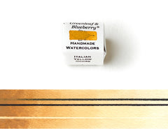
Combination Swatch
This swatch demonstrates:
- Opacity: Compare the two black lines, the top lines is drawn over the swatch and the bottom one is under the swatch. The more the bottom line has disappeared, the more opaque the color.
- Staining: The white line at the bottom of the swatch was lifted out. The whiter the line, the less staining the color.
- Value Range: Color is painted from most concentrated (at left) to least concentrated at right. The closer a color is to black at most concentrated, the wider its value range. (All watercolors painted onto white paper can be diluted to complete transparency, or white.)
Gravity Wash Swatch
A Gravity Wash Swatch is made by pre-wetting the paper, then holding it vertically at an angle, and applying paint from left to right at the very top of the wetted area.
This swatch demonstrates:
-
Granulation: Granulation display is influenced both by pigment particle size and behavior determined by chemical composition. Granulating colors are recognizable in Gravity Washes through their patterned and textured appearance.
-
Flocculation: Flocculation is the tendency for a color's pigment particles to cling together or be attracted to one another. Dispersion is the opposite. A flocculating color is recognizable in a Gravity Wash by a "jellyfish" appearance with the downward movement of the pigment resembling tentacles, while a dispersing color more resembles a distant rainstorm, as is the case with French Red Ochre.
-
Variegation: Variegation is the tendency for a color's pigment to express itself as more than one hue, usually as a result of a range of pigment particle sizes. In a Gravity Wash, pigment particles have an opportunity to settle by size a bit, with the smaller particles getting carried further to the edges of where the color travels. If you only notice one hue in a gravity wash, then it is likely not a variegating color.
- Tinting Strength: It can be difficult to determine tinting strength in controlled color swatches. Because Gravity Washes are less controlled, you can get a more unvarnished look at a color, enabling you to assess characteristics you usually only catch glimpses of when painting. Colors that appear very dark, intense, and that cover more of the wash area have a more intense tinting strength, while colors that appear more faint and taper out before reaching the bottom of the swatch have a weaker tinting strength. We have rated French Red Ochre as moderate tinting strength (3/5), though it can be argued that it is closer to a 4.
Value Scale Swatch
This swatch is painted in layers, starting with the lightest/least concentrated, and letting each layer dry before the next more concentrated layer is added. The leftmost and most concentrated layer is applied at a maximum concentration, which is generally not how watercolors are most often used, however this swatch is designed to display the full value range of a color.
This swatch demonstrates:
Value Range: Value range is a colors range from darkest (most concentrated) to lightest (least concentrated/most diluted). Value range is arguably one of the most important aspects of any watercolor. This type of swatch allows you to hold up a magnifying glass to that characteristic.
Our Pans
We work with standard plastic Full Pans. These are durable and lightweight as well, and fit into most commercial travel watercolor boxes.
Our Full Pans measure: 3cm x 1.9cm x 1cm
Full Pans can be thought of as the portable equivalent to a tube of watercolor paint. They are twice the size of a Half-Pan and hold a whole lot of color. This size is a great choice for artists who enjoy working large. Not only does this size pan hold more paint, it also has a greater surface area which can accommodate much larger brushes. This size is also a wonderful way to carry your favorite colors. If you have used up a Half-Pan and wish to replenish a palette staple, a Full Pan can be a nice next-step. Palettes of Full Pans also make excellent flexible studio palettes; they are large enough to be used in a home studio or table-top set-up while allowing you to close up the set and take it on the road.
More Information
- Overview of Pigments
- What Makes Our Colors Different
- How To Pick Colors & Create Your Perfect Watercolor Palette
Other Items You Might Find Useful For Watercolor Painting


Please be aware that every monitor and screen displays colors a little differently. We have done our very best to show our colors as they appear in person and on paper.
**Please Note**: These colors are NOT intended for children. Half-Pans are small and therefore a choking hazard. Please use only as intended.
All images and descriptions are copyrighted by Greenleaf & Blueberry®
© Greenleaf & Blueberry LLC 2011-2025