


Color Category Chronicles: Red
I'm excited to introduce a new blog post series: The Color Category Chronicles, which will detail :
- Origin of different color names
- Summarize their relevant light science
- Explore their position on the color wheel
- Provide an overview pigments that typically represent the category
- Offer information on how to mix various shades and hues within each category.
This series is designed to bring the color wheel to life, combining history, science, and color theory in a way that is relevant for the watercolor painter.
We are going to begin with the color category of Red. Somehow it tends to be the first color - linguistically, scientifically, and artistically. When listing the primary colors we begin with Red, when displaying the light spectrum we begin with Red, and indeed Red was the first to color to receive its very own name...
The Etymology of the Word Red

First off: why in the world would the etymology of color names really matter to a painter?
The reason is that words give shape to how we express ourselves, how we think, and even how we see. Being precise and intentional with your language not only allows you to express yourself with greater accuracy, it literally lets you see more clearly.
When painting and observing, I try to think in terms of pigment names as a way to practice color matching with my eyes. I like to use specific color terms such as Red, Yellow, Green, and Purple as categories both to organize my colors and create systems for how I think about and mix my pigments. Originally, I only wanted to use names for color categories that referred to color alone - which got me to thinking about the origins of our color names.
For some color names, such as Orange, it is relatively easy to trace their origins (the fruit came first), while others have been obscured by time and linguistic evolution. Such is the case with Red. Color names come into being at very different times over the evolution of a language, yet, from area to area, era to era, and one civilization to the next, color names entered each lexicon in roughly the same order (how crazy is that?!).
Almost unflinchingly, color names have arisen after an item or object of a matching color received its name: Black from ink, White from light, Red likely from blood, Pink from a flower, Teal from a duck, etc. Then, gradually, the term would become synonymous with the color, and then it would migrate to refering to the color specifically.
As civilizations evolved in complexity, so did language and its descriptors, but always on an as-needed basis. This is why the most distinct colors were named first (white, black, and red), and why we only arrived at such explicit terms for subtle hue variations as Teal, Magenta, and Chartreuse much more recently.
The etymology of the word Red can be traced back to some of the earliest languages: Proto-Indo-European (known as PIE, and spoken from 4500-2500 BCE), is the root language of all Indo-European languages (Europe, India, Iran, etc.), and Red is the only color name that can be traced back to a PIE root word. The PIE word was thought to be reudh. From there it entered Old Saxon as rod, Old Norse as rauðr, Middle Dutch as root, German as rot, Sanskrit as raktah, etc.
Originally spelled in Middle English as read, the surname Read still retains the original spelling to this day.
Indeed, reudh is the root of words such as ruddy, rust, russet, and ruby - all red-related terms. It has also long been linked with blood, which is likely where its link to symbologies of danger, passion, revolution, and sacrifice originate.
Interestingly, our blood is red because of the presence of iron and oxygen, not completely unlike iron-oxide rich soils. Even a quick peek behind the curtain reveals so may connections between our bodies, the earth, and pigments.
Red in Light Science

The electromagnetic spectrum is comprised of the light discernible to the human eye: the colors of the rainbow. We can see red as a result of light that predominantly consists the longest wavelengths in this visible range.
Longer light waves vibrate at lower frequencies and have lower energies than lightwaves with shorter wavelengths (such as blue and purple). This is why sunsets appear red and orange. At sunset, the sun is farther from us than it is at midday, when it appears more yellow. The longer light waves are able to travel farther distances without being quite so easily dispersed by the particles in the atmosphere. (Lightwaves of shorter wavelength, such as blue, have been more dispersed by the atmosphere on their way from the sun to our eyes at sunset).
These longer wavelengths and lower frequencies are also why we use red lights in photography dark rooms.
Understanding specific light wave science for each color isn't a necessity for the watercolor artist, however it can help answer questions about the world around you that you may be trying to paint! A deeper understanding of your subject can bring you closer to it, allowing you to depict it with greater intimacy and insight.
The Pigments That Represent Red
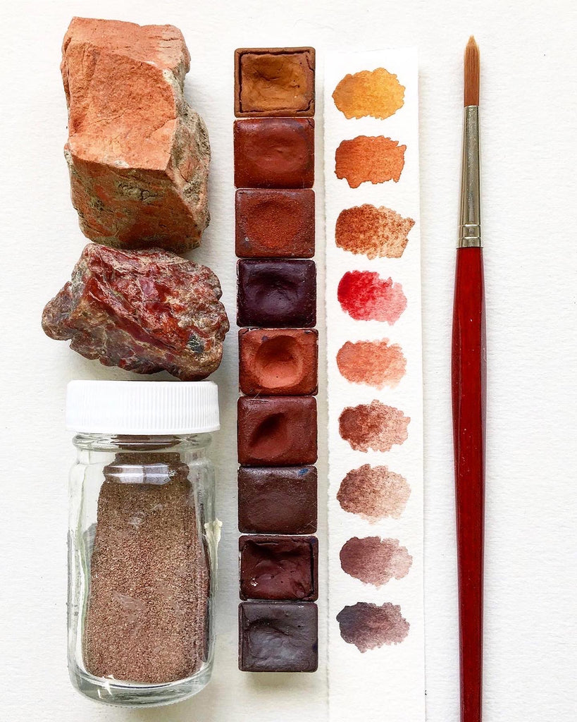
The main red pigments that have been and are still used by artists are:
- Red Ochre (an iron oxide)
- Cinnabar (the natural form of Vermillion, mercuric sulfide)
- Red Lead
- Cadmium
- Madder (a pigment made from the root of that plant)
- Cochineal (tiny red bugs that grow on a particular type of cactus)
- Synthetic chemical compounds (such as Pyrroles, Quinacridones, and Naphthols)
These pigments all have different chemical compositions, different sources and synthesization methods, different hues, different permanence, and different behaviors - the one thing they all have in common is expressing a hue in the red range.
Over the years I have enjoyed collecting red pigments and adding the ones to our line that have both high permanence and low or no toxicity. These are:
American Pipestone
Potter's Pink
Quinacridone Magenta
French Red Ochre
Moroccan Red Ochre
French Red Ochre Dark
Icelandic Red Earth
Pyrrole Red
Benzimidazolone Orange

I designed a travel palette to contain them all together as a collection - for monochrome painting, for exploring the red color category, for sampling so that favorites can be added to a new or existing palette.
What studying red pigments has taught me is that a single "true Red" does not exist. Red is best thought of as a color category that encompasses a wide range of pigments that hold different positions on the color wheel within the red area of it. Some are warmer, some cooler, some are more grey, and some have an intense high chroma.
In time, sampling and painting with different reds will lead you to your favorites, the ones most compatible with your work and that you most enjoy using.
Red's Position on the Color Wheel

Red is generally positioned at the top of the color wheel, flanked by orange at the left and purple at the right. When using color names as categories, it is important to remember that their borders blend into one another, rather than being hard boundaries (no matter how much more satisfying and convenient that would be).


This diagram more clearly shows you how to "plot" your pigments on a color wheel, though this one does not distinguish between high and low chroma.
I find it helpful to think in terms of "directions when mixing colors: A cooler (or bluer) red will be towards the right of the red section on the wheel, a warmer (or yellower) red will be towards the left of the red section. Though higher chroma and darker-toned hues are not illustrated in these diagrams, there is one further dimension: ! lighter or higher chroma red will be toward the "top" of the wheel, and a darker or greyer red will be towards the "bottom" of the red section.

"Cool" red is just a different way of describing a blue-red or a purple-red, just as "warm" red is a different way of describing a yellow-red or an orange-red.
Thinking in terms of red's place on the color wheel and these "directions" will help you when color mixing.
How To Mix Shades & Hues of Red
In general, and as mentioned above, there are four "directions" you can pull a Red color to mix the hue you want: up (add white), down (add black), right (add blue), and left (add yellow). Of course, there are all kinds of ways to pull your starting pigment in those directions:
Mixing Upwards
There are three ways to lighten or brighten your red pigment: You can add white to it, which will increase the opacity and have the effect of washing it out, you can dilute it with water which allows the white of your paper to shine through, or you can mix it with a lighter or higher chroma red (as you might if you added a small touch of Pyrrole Red to French Red Ochre).

Pyrrole Red at left is gradually mixed with increasing amounts of Titanium White. Another way to lighten or brighten this color would be to increasingly dilute it with water.
Mixing Downwards
If you want to tint your color to knock down the chroma or darken it, mixing in a black pigment is only one way to accomplish that. Another option is to add its color opposite. You can also add a mixed black, a grey, or a brown. All of these are ways to "tone down" your red pigment.

Top: Pyrrole Red is mixed with Lamp Black in gradually increasing amounts, essentially greying it down and creating a series of tints.
Middle: Pyrrole Red is mixed with Phthalocyanine Green, its complementary color (or color opposite on the wheel) in gradually increasing amounts.
Bottom: Pyrrole Red is mixed with Italian Brown Earth in gradually increasing amounts.
Mixing Right
If you want to cool off your red pigment to create a purple, magenta, or alizarin tone, you can mix it with blue, purple, fuchsia, or a cooler red.

Top: Pyrrole Red is mixed with Ultramarine Blue in gradually increasing amounts, pulling it in a cooler, more purple direction.
Middle: Pyrrole Red is mixed with Dioxazine Violet, to create a range of alizarins and fuchsias.
Bottom: Pyrrole Red is mixed with Quinacridone Magentas in gradually increasing amounts. This works to pull Pyrrole Red in a cooler direction without significantly dampening its chroma.
Mixing Left
If you want to warm up your red pigment to create a more fiery tone, you can mix it with a yellow, orange, or warm red.

Top: Pyrrole Red is mixed with Quinoxalinedione Yellow in gradually increasing amounts, pulling it in a warmer direction, and offering up a wide range of warm reds, oranges, and red-yellows.
Middle: Pyrrole Red is mixed with Benzimidazolone Orange, to create a range of fiery reds.
Bottom: Pyrrole Red is mixed with Pyrrole Scarlet (an as of yet unreleased G&B color) in gradually increasing amounts. This works to pull Pyrrole Red in a slightly warmer direction without significantly decreasing its chroma.
Just remember: When mixing colors, if your starting pigment is high in chroma and you want to retain that high chroma in your color mixture, select a mixing pigment that is both high in chroma and as close to your starting pigment as possible on the color wheel. For example: If you start with Pyrrole Red and your goal is to mix a nice magneta or fuchsia for a floral painting, avoid using a blue. Instead select a purple. Choosing a farther-away color on the wheel has the automatic effect of greying down your mixture.
How To Make Reds Pop in Your Paintings
One of the main challenges painters face is how to make colors pop and glow. After all, our expression is limited to the colors on our palette. However, if you understand how to use them cleverly, you can make them appear as more than they are. Some paintings appear to emanate light. This isn't because the pigments are especially unusual - it's because the artist knew how to use them.
There are two main ways to make your Reds really pop:
Color Relativity: In essence this utilizes the fact that the appearance of colors changes, depending on neighboring hues. To use color relativity to make a red pop in your painting, tone down (or grey down) the rest of the colors in your painting. This is how the Old Masters were able to make Cinnabar and Red Ochre look shockingly vibrant.
Juxtaposing Complimentary Color: Complimentary colors have a way of augmenting one another. You'll be able to give your red a boost by placing a green adjacent to it.
While Red has been somewhat dethroned as an undisputed primary color, it still retains its place on the color wheel and its significance on the artists palette - and in our painted compositions. Understanding its origins across disciplines and how to mix its full glorious range using the pigments within your reach will lend depth and power to your paintings.
As always, wishing you happy painting,
