


How To Mix Watercolors: Three Approaches
Mixing colors is unfortunately one of the more fraught areas of watercoloring. Some painters are afraid to attempt it at all, while others would like to, but either don't know where to start or are frustrated at getting unintended results.
In this post, I'll be talking about the often-overlooked mechanics of color mixing: where to mix your colors, how much paint to use, how to adjust mixtures, and different mixing methods. I'll be referencing color theory, in particular color temperature, which I have already written a blog post about here. For information about which colors to mix and why, I recommend you take a peek!
There are three main approaches to color mixing, all of which are useful for different applications and all of which will yield slightly different results. Each one is a handy technique to have in your toolbox.

The Sketcher's Bijoux Set: A palette and color collection specifically designed for color mixing. The travel palette features three large mixing areas in the lid instead of the usual two, so that each secondary color mixture has a dedicated mixing space. The color collection includes two sets of primary colors: Ochres & Modern, along with secondary colors for convenience, a brown, and a greyscale. There is no hue this palette can't mix!
Mixing On A Mixing Palette

This is the classic approach, and the one that will yield the most precise mixed colors. A mixing palette is any surface on which you mix colors: the lid of your travel tin, a plate, an enamel tray, etc. (Note: If using a new enamel surface to mix colors, you can save yourself the frustration of dealing with colors beading up, by priming the surface, which you can read about here.) To mix colors on a mixing palette, you will use your brush to remove color from your pans or wherever you have deposited dollops of tube paints, and deposit it (still using your brush) onto your mixing surface.

Another feature of the enamel mixing palettes (above is our rectangular version) is that they have a thumb loop which allows you to hold your mixed colors (and pans if they are magnetized) and your brushes with one hand while you paint with the other. This arrangement allows you to easily stand, especially useful when painting outdoors.
For the cleanest possible mixed color, you will want to use a clean mixing surface, and rinse your brush well between colors.
Use your brush to deposit two pools of color next to each other (but not quite touching) on your mixing surface.
The size of the pools/amount of the color depends on a few factors:
- If you want more intense, saturated color, use more pigment and less water.
- If your painting is larger, create a larger pool of color. (If you are working on a very large scale, you may even want to mix your colors in a small bowl.) For smaller scale painting, make a smaller pool.
- If your mixing area is very small, that might constrain the size of your color pools, or you may need to wipe off your mixing surface a few times while painting. It's a good point to be aware of to make sure your mixing surface is large enough to allow you to mix colors in enough quantity for the size you are painting. Most travel palettes will accommodate a sketchbook page.
- Size of the pools should also depend on the color characteristics of your chosen colors. For example, if you are mixing a low tinting strength color and a high tinting strength color, you will want a larger pool of the lower tinting strength color and a smaller pool of the higher tinting strength color (since a little goes a long way!)
- If you are just beginning to mix colors, begin by depositing quarter-sized pools of moderate concentration. That will be a good starting place, and you will quickly realize if you need larger or smaller pools.

Two color pools: Quinacridone Magenta & Phthalocyanine Cyan - both about the size of a quarter, at medium concentration, and with space between for the mixed color to emerge.
Once you have your pools of color on your mixing palette, rinse your brush, then dip it into the lower tinting strength color at the edge of the pool, and pull the color into the space between pools. Then (no need to rinse your brush), pull a very small amount of the higher tinting strength color to the space between pools. Gradually, make a mixed pool in the center, pulling in whichever color you need more of until you have the mixture you want.

Start by pulling one of the colors to the middle (it is best to start with the color that has the lowest tinting strength - this helps avoid the mixture getting away from you).
By working with pools of color on your mixing palette, you will be able to keep you pans clean. This is a good way to begin color mixing. However, you may prefer to skip the "pooling process" and dip your brush from pan to mixed pool. This can work very well, however you will end up cross-contaminating your color pans. For some painting approaches, this is no big deal, and many painters delight in a messy palette. Others regard it as sacrilege and depend on clean, crisp, carefully matched colors.
When mixing two different colors (such as primaries), watch for the mixed center pool to turn a distinctly different color. If you are going for a roughly 50/50 mixture, you will want to watch for what I call the "click point". The mixed color will look distinctly different from either of your starting pools of color.

If you need to add more color to one of your original pools, rinse your brush and dip back into your pan to deposit more into your original pool, then continue mixing.
Once you have achieved the color you want, start painting! Make minor adjustments to the mixture as necessary, as you paint. If your mixture dries on your mixing surface, simply re-wet it and keep working. In this way you can return to a mixture if you need to take a break or come back another day.
Layering

Each of these colors was laid down one at a time in layers from left to right, each layer being allowed to dry before the next was applied. The transparency of the watercolors creates an optical mix. It is just another approach to color mixing to keep in your tool box of techniques.
Layering is color mixing and it is not color mixing -- at the same time. Layering is really optical color mixing. Instead of using a mixing palette and swirling colors together, you layer them one on top of the other directly on your paper, letting each layer dry before adding the next one on top.
To layer colors, you will need to select transparent colors, otherwise the top layer will obscure whatever is beneath it. In watercolors, most color are transparent, but some are more so than others.

Quinacridone Magenta, Quinoxalinedione Yellow, and Phthalocyanine Cyan, each layered one after the other.
The key to layering bears repeating: you must let each layer dry completely before adding the next one. Simply paint a color onto your paper, let it dry, then paint a layer of a different color. The two transparent colors layered together will create the effect of a mixed color - similar to layered glass or theater gels.
Some notes on layering colors:
- The top color layer dominates the "mixture". To achieve a 50/50 mix when layering, use a more transparent top layer so that the lower layer(s) can still shine through.

At left, both colors had a layer of Quinoxalinedione Yellow laid down first. When it was dry the color at right was brushed over the top. The color at right is a single layer. Note the differences. These swatches were painted on rough Arches watercolor paper, and the yellow layer was allowed to shine through by keeping the top layer light and rapid, as described below.
- Using more textured paper when layering makes possible an additional effect: Saturate the paper with your first layer of color and let dry. Then, lightly brush the top layer onto the paper, just letting the brush skim the most textured parts of the paper. This allows the lower layer to shine through and can create a textured or even glowing effect. (This technique is similar to scumbling, but the brush isn't quite as dry.)
Mixing On Paper
This approach is very freeform. It allows you to put the watercolors themselves in the lead. It kicks the mixing palette to the curb, throws the waiting-for-paint-to-dry routine out the window, and requires you to get comfortable with letting your colors get a little messy. However, by knowing your colors well, you can still exert plenty of control on your mixing outcomes using this method.

Color were mixed on paper to create the effect of shadows on the underside of clouds. Phthalocyanine Cyan mixed with Quinacridone Magenta to create a beautiful purple shadow color. Armenian Purple Ochre was then added sparingly for texture.
You can mix colors wet-in-wet in a wash to create beautiful blooms and gradual transitions - just create your wash and then begin adding colors. You can add more water, more color, and blend. Just be aware that less is often more and these areas will dry differently than how they appear wet - beware of overworking and surrender to the beautiful effects each pigment creates.
A second variation is putting down color and, while it is still wet, adding to it. The difference is that this isn't really a wash, though it does share some principles. This method may be applied to the underpainting of a leaf in a botanical painting. You may lay down a layer of diluted green, and while it is still wet add a line of darker green to create depth and shape to your leaf. Then when that is dry, you could add the veins and other details over the top.
This method will inevitably leave your pans a bit messy. Simply give your palette a quick rinse under the faucet if your colors are low or no toxicity. If you have cobalt or cadmium pigments you'll want to use a well-rinsed brush to "wipe" off the surface of your colors and then dispose of the paint water responsibly.
Having The Right Colors
First of all, it is important to understand that you can mix any colors you wish. Understanding color theory, particularly color temperature, will help you decide which colors will help you mix the hue you have in mind.
It also helps to understand that single pigment watercolor will mix the most cleanly and predictably. Many watercolors these days are mixtures of two or more pigments to approximate specific hues. Because this can lead to frustration when mixing, we only offer single pigment colors.

Lastly, having a solid set of primary colors can give a palette of colors a good backbone. The addition of a black or dark grey that doesn't have an overpowering tinting strength can allow for easy tinting adjustments of colors. We designed our CMYK & CMYKW palettes especially with these thoughts in mind: to use as a minimalist palette, for a kind of color mixing bootcamp, to add to an existing palette, or use as the foundation of a new palette that will be built from scratch.
Making Adjustments

Often when we think of color mixing, we think of two colors being mixed together. However, using more than two colors is often necessary, especially when trying to match colors. Here are a few tips to make those minor adjustments to get where you want to go:
You can pull your mixture in a warmer or cooler direction by adding more of a color that is next to it on the wheel. For example, to make a cooler yelllow, add green (or blue), and to make a warmer yellow, add orange (or red). When making minor adjustments, the closer the color is on the wheel the better.
- To grey down a color, use a grey, a black, or the color's opposite.
- If mixing a more neutral color, avoid starting with high chroma colors. Instead start with an Ochre, then add a small amount of a higher chroma color to punch up the volume if necessary. This is especially true for skin tones.
- When using watercolors, simply dilute a mixture with water to lighten it.
Color Mixing Notes
One important detail that is often overlooked on the topic of color mixing: notes! Especially if you switch between a few different palettes or work with a wide range of colors, forgetting which colors you used in a mixture is all too easy! If you plan to resume work on a painting or match a mixed color you enjoyed working with, notes are essential.
It is best to select a system to build your habit around. You can make color notes in the margins of your sketchbook, on the opposite page face of your sketchbook, or on scraps of watercolor paper that you will date and label with the painting they correspond to.
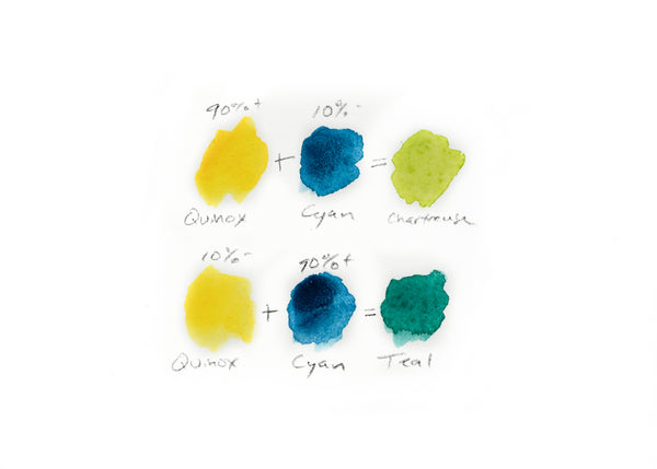
One way to make simple color mixing notes.
I personally use a system of color swatches annotated with color label, optical percentages of color used, and simple mathematical symbols to keep track of which colors I mixed and in what quantities/concentrations.
This simple habit will not only provide an invaluable reference, but offers an opportunity to become more aware of what you are doing and determine which colors are your favorites.
As always, thank you for being here and wishing you happy painting,
